One front door, five kinds of shopper. A single path couldn’t serve them all.
A U.S. telecom company wanted to rethink the first few metres of its stores and bring its customer app into the arrival experience. I led field research across the whole journey, from planning at home to the store entrance, and found that shoppers arrive with very different mindsets, and want to choose their own way in.
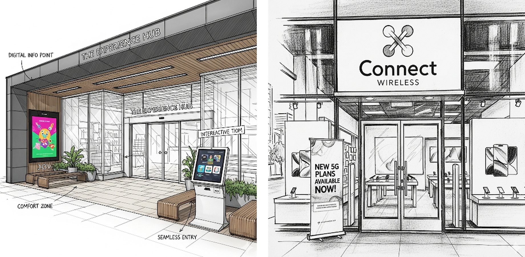
SituationA store entrance built for one kind of shopper
The company wanted to redefine the entire front-of-store experience: what customers see from the street, what happens at the door, and how its customer app could guide them once inside. The goal was an engaging, informative arrival that would set a new standard for in-store guidance.
The existing front of store offered one linear path for everyone: walk in, check in, wait. More signs had been added over time, but shoppers still seemed unsure where to go.
Even with more signage and communication, many shoppers still felt confused about where to go.
Existing outdoor signs were often unhelpful, and sometimes made the process more difficult.
Customers were missing digital tools that could have made their visit easier.
Shoppers used the app to plan a visit, but few expected to use it inside the store.
TaskUnderstand how shoppers think about arriving
My objective was to understand shoppers’ mental models of the front of store: their motivations, patterns and preferences. That would show where the journey could give people the information, interactions and experience they actually wanted. I started by writing down what the team assumed, and turned it into a hypothesis we could test in the field.
What we assumed
- A single front-of-store path isn’t enough for every shopper.
- Shoppers have different needs and mindsets that the linear approach ignores.
- More flexible pathways and clearer directions would improve the experience.
What we set out to test
- If shoppers can choose their path and are guided clearly for each option, their visit will feel more positive and more efficient.
- Tested by observing behaviour in store and gathering feedback on proposed improvements.
ActionFollow the journey, from home to the shop floor
01Split the arrival into four stages
Arrival doesn’t start at the door. I framed the study around four stages, each with its own questions and touchpoints.
Pre-visit
What do appointment, pickup and walk-in customers need before they leave home?
How do customers and prospects differ?
TouchpointsStore pages, app, appointment and pickup flows
Store exterior
Do people passing by notice and value the window, A-frame and door messaging?
Do they use the entrance QR code?
TouchpointsExterior, window and door messaging
Entrance
What does each segment need from the front of store?
How do check-in and queues work for customers versus prospects?
TouchpointsCheck-in, kiosks, wait times, signage, app in store
Beyond check-in
What do shoppers want to do on their own while waiting?
Do they expect quick self-service purchases?
TouchpointsSelf-shopping, discovery before a consultation
02Watched first, then asked
How people move through a doorway is hard to describe afterwards. Watching first meant interviews could ask about real moments we had seen. An online survey would have been faster, but it would only have captured what people remembered.
Following shoppers from pre-visit planning to the shop floor showed that problems at the door often started at home.
03Found where each stage broke down
Pre-visit
Shoppers wanted popular times, live wait times and real-time stock before coming in.
Prospects needed a “new customer” appointment option to reach a specialist.
Store exterior
Shoppers weren’t looking to be informed outside; they were distracted and on the move.
A-frames felt generic, QR codes felt gimmicky, and digital signs had glare and moved too fast to read.
Entrance
The main need was a seamless next step from pre-visit research into action.
Most wanted instant check-in to say they were ready.
“This is my need; how quickly can I talk to a rep?”
Beyond check-in
Self-discovery check-in was confusing and slowed things down.
People exploring on their own relied on static sheets, not digital tools.
Preferences, mindsets and expectations varied widely. The store needed an experience that was simple, direct and engaging for all of them.
Some shoppers felt overwhelmed by visuals at the door and struggled to begin. People started in different ways, and some avoided checking in at all.
Many shoppers didn’t notice digital pricing, lockers or in-store pickup, so they relied more on staff.
Shoppers used the app to plan, but few expected to use it in store. Preparing them before the visit could ease the pain at the door.
“Give me the experience I want. I prefer to choose.” One path doesn’t fit all: the store needed several ways in, each with clear directions.
04Turned the patterns into five shopper mindsets
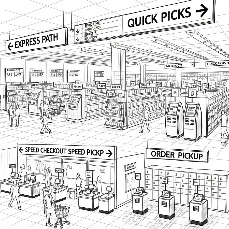
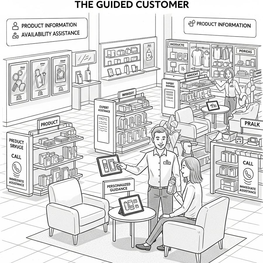
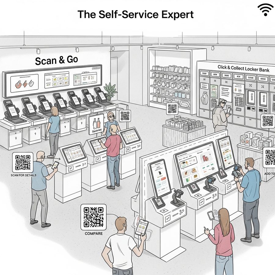
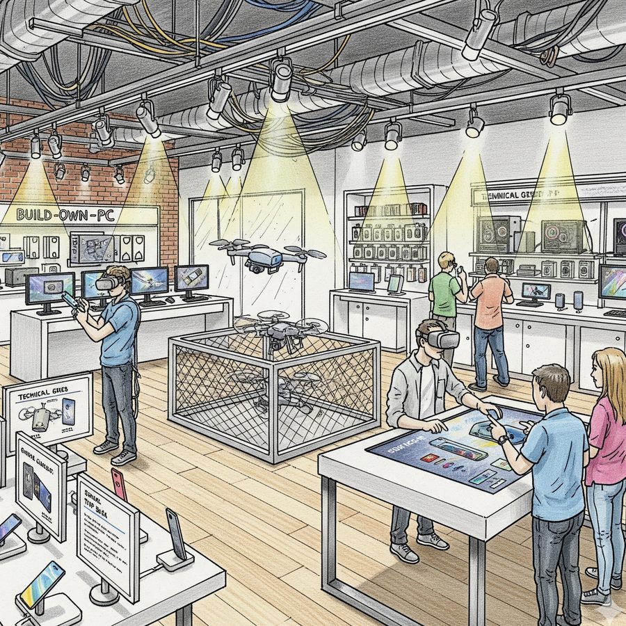
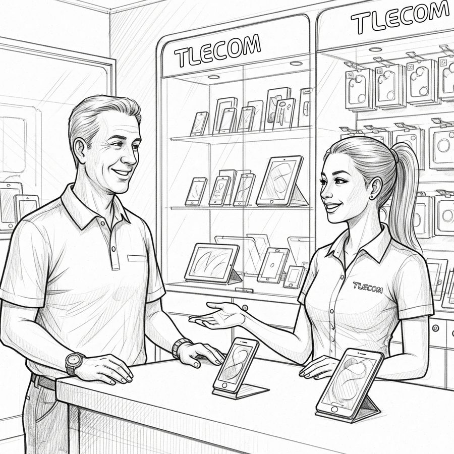
Sketches are illustrations of each mindset, not real stores.
ResultThe findings shaped the front-of-store redesign
One front-of-store path for every shopper.
Five mindsets, each with a clear way in.
- Pre-visit preparation matters. Shoppers research before they come, and expect that effort to pay off in store.
- The front of store is an action point. When shoppers arrive they are ready to act; the store should help them do it without friction.
- Clarity beats more signage. Simple, direct guidance helped more than adding messages.
- On attribution: the retail and design teams owned the redesign. My part was leading the research, the framing and the shopper mindsets that guided it.
ReflectionWhat I’d do differently
- Count as well as watch. Simple tallies during observation (how many people check in straight away, how many skip it) would have made the patterns easier to compare across stores.
- Test pathways with each mindset. The next step is to put concept pathways in front of each type of shopper and see which one they actually choose.
- Bring the app team into fieldwork. Seeing shoppers leave the app in their pocket would have made the pre-visit opportunity land faster.
Client details are anonymised. Store sketches are AI-generated illustrations, not real stores. The research, process and findings are real.