Context
Aurumgemé is a fine jewellery brand from one of India's largest gold jewellery retail groups. Its customers span ages 8 to 80, and it sells through stores, online marketplaces and a mobile app. About 68% of visitors left from the Product Display Page (PDP), the one screen where a browser decides whether to become a buyer.
I worked on it at Thence, a UX design agency in Bengaluru, as the only researcher on the project.
The question
- Why are people leaving the PDP, and what is missing compared with the competition?
- Which problems are worth fixing first?
- Does the redesign actually work, and how would we know?
Why this method
Being the only researcher on a business-critical decision meant I could not rely on any single source. So I triangulated across four independent ones before acting on a finding: competitive and SWOT analysis (BlueStone, CaratLane, PC Chandra), a heuristic evaluation of the PDP, 15 user interviews with task analysis, and Google Play reviews.
I also did not want to call it a win because the team liked the new design. I planned a controlled comparison from the start.
What I did
- Feature analysis across four sites, scoring each on 15 UI/UX features (Aurumgemé 10/15, BlueStone 11/15)
- 15 interviews and task analysis across browsing, product selection, cart, payment, returns and wish lists
- Affinity mapping and thematic analysis, then five personas, from gift-buyers to self-purchasers
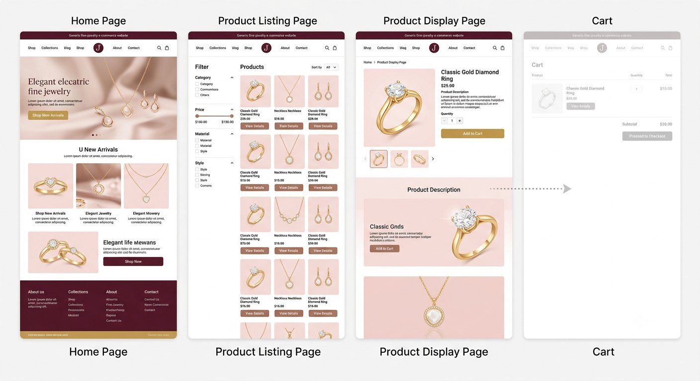
- A prioritisation chart scored on severity and design phase, then 10+ wireframes and a high-fidelity PDP
- Moderated usability testing, then a post-launch round of interviews and telemetry
What I found
They needed to trust the page.
The messy middle
- One journey map, not five. I had scoped a map per persona, but the timeline allowed one. I chose one extensive consolidated map over five shallow ones.
- Confidentiality. Low and mid-fidelity work stays private. I built this case study around what can be shown: the process, the strategy and the validated result.
- Sole researcher. I built in extra checks (competitor benchmarks, heuristics, interviews) so no single method carried the whole case.
Outcome
I compared the old design (Group A) with the redesign (Group B), 15 participants each over 3 weeks, using post-task surveys, interviews, telemetry from the Aurumgemé team and a t-test.
| Metric | Before | After |
|---|---|---|
| Bounce rate | 51% | 30% |
| Conversion rate | 3% | 6% |
| Task completion | 70% | 88% |
| Satisfaction (out of 5) | 3.2 | 4.5 |
| Average task time | 97 s | 64 s |
Small sample (n=30). I report it as strong directional evidence, with the full hypotheses and method shared with the client.
What I'd do differently
- Build all five persona journey maps. A gift-buyer, a self-purchaser and a trend-follower hit different friction, and one map averages that away.
- Pick the idea with the most value. There were many good directions. The discipline was choosing the one that moved the user's actual problem.
- Test, test, test. Being open to feedback at every stage is what took the product well beyond my first draft.