← Back to Work
UX Research · Enterprise · B2B

Why partners resisted migrating to a new enterprise platform

A mixed-methods research study investigating why enterprise partners avoided a newly launched B2B platform — and what structural, navigational, and workflow barriers were driving them back to legacy tools.

Role
Contract UX Researcher
Duration
6-month contract
Methods
Mixed methods
Outcome
22% adoption increase
View

Enterprise partners kept returning to legacy tools even after a new platform launched. Four research-backed findings showed the problem wasn't change resistance — it was structural friction built into the platform itself.

VL Central — Organization Dashboard

VL Central — the enterprise partner portal used to manage customer agreements, licensing, and financial reporting. AI-generated representation.

The Platform
What is VL Central?
A unified B2B partner portal for enterprise licensing management

VL Central (Volume Licensing Central) is the enterprise partner portal used by resellers and managed service providers to oversee software agreements, manage customer portfolios, and handle financial reporting — all in one place. It replaced a collection of legacy tools that partners had been using for years.

The problem: despite richer functionality, adoption was slow. Partners kept switching back to the old tools. My job was to find out why.

Key Findings
🗺️
Navigation made reports impossible to find
40+ report options in a single dropdown, 14 named "Revenue" — partners couldn't predict which one matched their task.
🔁
Missing workflows forced legacy fallback
Scheduled report downloads — critical for weekly operations — didn't exist in the new platform. Partners kept legacy running in parallel.
📊
Financial pages overwhelmed users
Every data dimension displayed simultaneously — no filtering, no hierarchy. Partners spent 3.5 minutes searching a single screen.
🔔
Alerts described problems without next steps
11 of 16 partners regularly ignored alerts. They described events but never told partners what to do next.
📉
SUS score: 61 — marginal usability
Formal usability benchmarking placed the platform below the 68 industry average — adoption barriers were real, not just change resistance.
🤝
Data trust was broken
Partners cross-checked financial numbers in the old portal because they didn't trust the new system's reporting. The data source wasn't visible.
Central Insight
The platform was organized around data structure, not partner workflows. Every barrier traced back to this single root cause.
Research Scale
50+
Partner Interviews
Enterprise partners across roles and regions
90
Days of Telemetry
Behavioral data analyzed to validate qual findings
22%
Adoption Increase
Following alert redesign implementation in Sprint 14
💡
As a contract researcher, the scope was pre-defined. I was brought in specifically to run usability testing, interviews, and synthesis — not to redesign the platform. That constraint shaped how I framed research questions, prioritized methods, and communicated findings. I focused on making insights actionable enough that the internal team could move without me.
🖼️
Note on images: All screenshots in this case study are AI-generated representations of the platform. Real product screenshots cannot be shared due to NDA and confidentiality obligations from my contract engagement.
Section 01

What is VL Central?

Platform Background
Volume Licensing Central — a unified enterprise partner portal

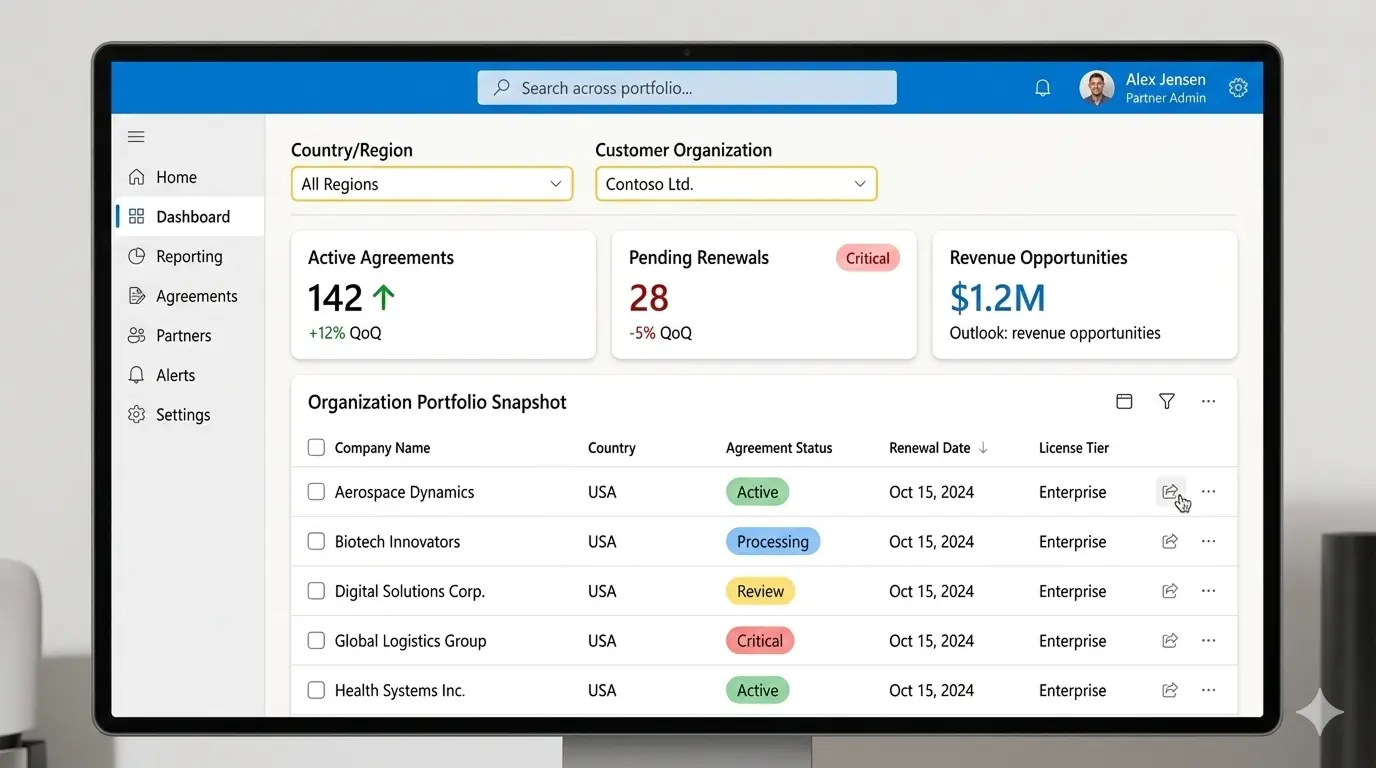
VL Central is the B2B platform used by resellers, managed service providers, and enterprise licensing partners to manage software agreements, track customer portfolios, monitor renewals, and generate financial reports — all within a single interface.

Before VL Central, partners operated across multiple legacy tools: one for agreement management, another for financial reporting, another for alerts. The new platform was designed to consolidate these into one place. In principle, it was a significant improvement. In practice, adoption stalled.

Partners continued using the old tools alongside the new platform — running parallel workflows, cross-checking data, and relying on institutional knowledge built around systems they'd used for years. My engagement was to find out why.

VL Central — Organization Dashboard Overview

The VL Central partner dashboard — the central hub for managing agreements, licensing, and financial operations. AI-generated representation.

The platform was built by a major enterprise software company. It served thousands of partners globally, managing agreements worth billions in annual software licensing revenue. The stakes for getting the UX right were significant — but adoption remained stuck despite a capable product team and a substantial technical investment.

Section 02

Context & Research Questions

Despite improved functionality over the legacy tools, adoption was slow. Partners continued using legacy systems even after migration deadlines passed. The internal product team had hypotheses — navigation was confusing, some features were missing — but lacked research evidence to confidently prioritize investments.

I was brought in to investigate three core questions:

Why were partners reluctant to switch?
Was this genuine change resistance — or were there specific barriers in the platform itself?
Were there usability gaps or missing features?
What did the legacy tools do that the new platform couldn't — yet?
Where should engineering invest to accelerate adoption?
What would deliver the most impact with the least implementation effort?
Research Framing
This wasn't a question of whether the new platform was better — objectively it was. It was a question of whether it was good enough to disrupt established partner workflows. In enterprise software, that's a very high bar.
Section 03

My Role & Contract Constraints

I joined as a contract UX researcher for a 6-month engagement. The research scope had been largely pre-defined by the internal product team before I arrived — they needed someone to execute a structured research programme, synthesize findings, and make recommendations actionable for the roadmap.

Contract Scope — What Was and Wasn't in Scope
  • In scope: Designing and conducting the research plan, running interviews and walkthroughs, usability benchmarking, telemetry analysis, synthesis, presentation of findings to stakeholders.
  • Out of scope: Platform redesign, wire framing, prototyping, or direct design delivery. My role ended at recommendations — implementation was owned by the internal team.
  • Pre-defined parameters: Methods (interviews + usability testing), participant types (enterprise partners), and timeline (6 months). I had latitude within those parameters, not outside them.
  • Access: I worked closely with PMs, engineers, and a data analyst — but the internal team owned the product. I was an external collaborator, not a core team member.

This context matters for understanding the research choices I made. Certain methods I might have preferred — longitudinal diary studies, co-design sessions — were outside the contracted scope. Others were constrained by timeline, access, or stakeholder readiness. I document these trade-offs explicitly in the Research Design section.

My responsibilities included:

50+
Partner Interviews
Semi-structured, task-based contextual walkthroughs
16
SUS Evaluation
Quantitative usability benchmark with 16 participants
90d
Telemetry Analysis
Platform behavioral data with the analytics team
HAX
AI Feature Audit
Human-AI Interaction guideline evaluation
Section 04

Research Design & Process Decisions

Rather than delivering a single end-of-project report, I shared insights with the product team as they emerged throughout the engagement. Every major research decision involved a deliberate trade-off. Below is the design logic behind each choice — and the alternatives I considered but didn't pursue.

Decision 01
Mixed methods — qualitative + quantitative
Why: Qualitative interviews alone would surface what partners struggled with but not how often or how severely. Adding telemetry and SUS data allowed me to triangulate — moving from "partners said they struggled" to "we can show exactly where and how often." This gave product managers evidence strong enough to justify roadmap prioritization.
Alternative not chosen Qualitative-only research would have been faster and sufficient for directional insights. I chose not to do this because the product team needed prioritization evidence, not just discovery — and a single qualitative signal wasn't strong enough to justify engineering investment on a 6-month timeline.
Decision 02
Contextual walkthroughs, not retrospective interviews
Why: Asking partners "what do you find hard about the platform?" in a decontextualized interview would surface recalled experience — biased toward what they remembered last, or what sounded like a reasonable complaint. Structuring sessions as live task walkthroughs ("show me how you find your most recent revenue report") surfaced real friction in real workflows, not reconstructed frustration.
Alternative not chosen Retrospective interviews would have been easier to schedule and recruit for — shorter sessions, no screen sharing required. I considered this for remote participants but chose walkthroughs for all sessions because the friction I was investigating was workflow-level, not attitudinal. You can't observe navigation confusion by asking about it.
Decision 03
Continuous insight sharing, not end-of-project reporting
Why: A single end-of-project report is high-risk in a contract engagement — if the team disagreed with findings or needed re-framing, there was no time to course-correct. Sharing insights weekly as they emerged meant the product team could validate assumptions in real time, adjust priorities before they became costly to reverse, and arrive at the final synthesis without surprises.
Alternative not chosen End-of-engagement reporting is standard practice in many contract research roles and avoids the overhead of continuous documentation. I didn't choose it here because the team was actively making roadmap decisions throughout my engagement — waiting 6 months to share findings would have meant those decisions were made without research input.
Decision 04
SUS + HAX — standardized frameworks
Why: I chose the System Usability Scale (SUS) and HAX (Human-AI Interaction) guidelines rather than custom evaluation criteria because standardized benchmarks are defensible. A SUS score of 61 is a data point that resonates with non-research stakeholders — it's below the 68 industry average, it's a number with a history, and it sets a measurable target for improvement. HAX gave AI-feature findings a shared evaluation language with the engineering team.
Alternative not chosen I could have designed custom heuristic criteria specific to enterprise partner portals. This would have felt more tailored but would have required additional buy-in time, carried less credibility with engineering stakeholders, and couldn't have been compared against external benchmarks. Standardized frameworks reduced the cost of communicating findings upward.
Decision 05
RICE for prioritization, not effort-impact matrix
Why: Effort-impact matrices are common but force a false binary — they treat "impact" as a single dimension when it isn't. RICE (Reach × Impact × Confidence ÷ Effort) separates confidence from impact, which matters in research settings where some findings are highly evidenced and others are inferences. Using RICE meant I could quantify the strength of evidence behind each recommendation, not just its perceived value.
Alternative not chosen Effort-impact matrices are faster to complete in workshops and more intuitive for non-research stakeholders. I considered using one for the prioritization session but chose RICE because the product team had a mix of well-evidenced findings (navigation confusion, alert clarity) and less certain ones (onboarding gaps). RICE's confidence dimension gave us a principled way to separate them.
Section 05

Key Findings

Four distinct barriers explained why partners kept returning to the legacy system — each supported by both interview evidence and behavioral telemetry.

1
Navigation made reports impossible to find

Partners struggled to locate critical reports. The navigation was organized by data type rather than partner workflow, forcing users to browse multiple categories before finding — or giving up on — the report they needed.

The reporting dropdown contained 40+ options, with 14 report names including the word "Revenue" — making differentiation nearly impossible without opening each one individually. Telemetry confirmed this: 74% of active users logged into both the new platform and the legacy system in the same session — browsing the new interface but completing critical tasks in the old one.

"I spend more time figuring out what to look at than actually doing my work." — Partner Manager, Enterprise Account
Report Category Selection — VL Central

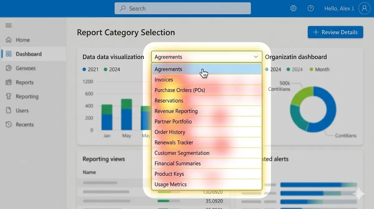
The report category selection screen. 40+ options, overlapping names, no grouping by task type. AI-generated representation.

Finding 1 — Navigation Audit Evidence
1
40+ report options in a single dropdown — No grouping by task type or workflow. Partners had no way to predict which report matched their goal.
2
14 report names containing "Revenue" — Partners described opening reports one by one to find the right one. 62% of report searches ended in a navigation change rather than a successful download.
3
Label names don't match partner mental models — The platform used internal product naming conventions. Partners thought in terms of tasks ("get my monthly billing report") not data categories.
2
Missing workflows forced partners back to legacy tools

Partners depended on capabilities in the old system that the new platform had not yet replicated. Scheduled report downloads was the most critical gap — cited by 9 of 16 participants as the primary reason they could not fully migrate.

Without it, partners manually exported data every week, then rebuilt reports in Excel. For teams managing large portfolios, this added hours of low-value work every week. The legacy tool completed this in 4 steps. The new platform broke at step 4 with no fallback path.

"I export the data and rebuild the report in Excel every week. I can't stop doing that until the new system has scheduling." — Partner Admin, Enterprise Account
Partners who attempted the weekly export workflow in the new platform spent an average of 6 minutes before switching back to legacy — confirming the workflow gap as a structural problem, not a navigational one.
3
Financial pages overwhelmed partners with undifferentiated data

The financial reporting page displayed all data simultaneously with no ability to filter, sort, or prioritise. Every dimension — pending renewals, revenue figures, billing status, historical exports — competed for equal attention.

Partners spent an average of 3.5 minutes on this screen searching for the specific data point they needed. This was the longest dwell time of any page in the platform — not because the data was deep, but because there was no hierarchy to guide attention.

"There's so much information here that I don't know where to start." — Finance Lead, Enterprise Partner
Purchase Orders — Dense Financial Layout

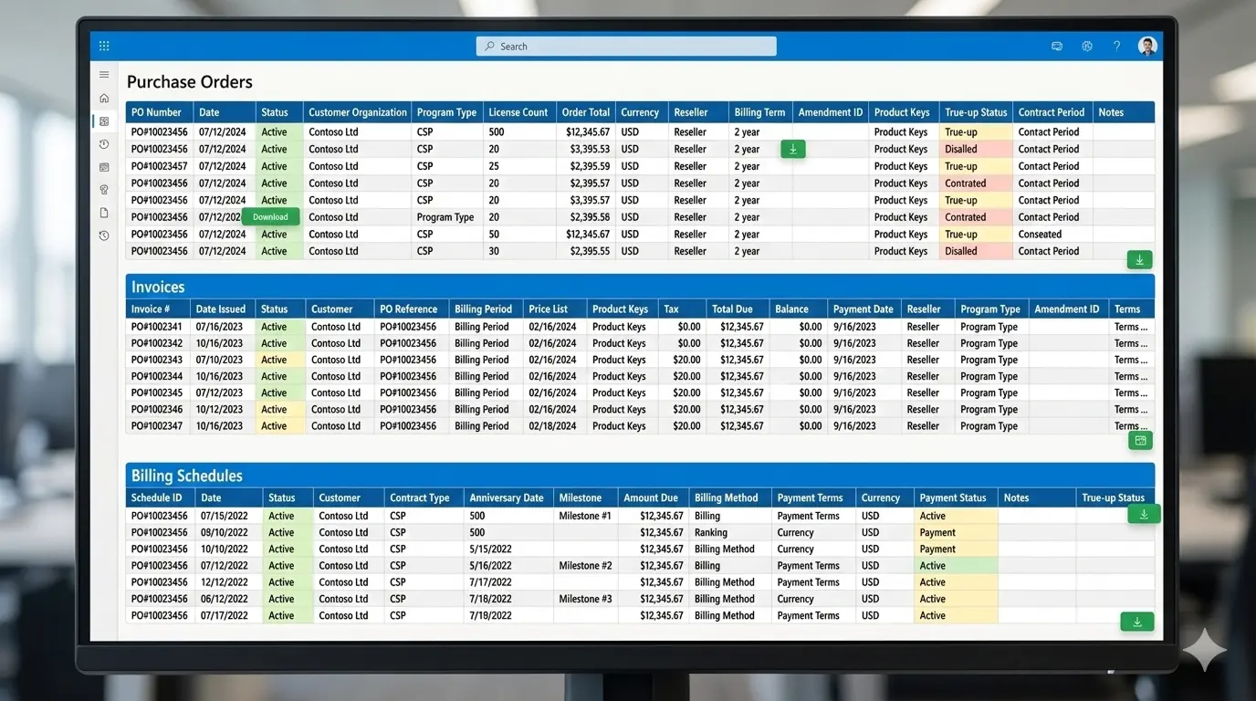
The financial reporting screen — all data dimensions displayed simultaneously with no filtering capability. AI-generated representation.

Finding 3 — Financial Layout Audit Evidence · 8/12 participants flagged
1
Too many data columns at once — All financial dimensions displayed simultaneously with no filtering or prioritisation, forcing partners to scan every column to find relevant data.
2
No visual hierarchy or grouping — Critical metrics (pending renewals, revenue at risk) share equal visual weight with routine data, making it impossible to identify what needs attention first.
3
No actionable signal — Partners had to mentally process all data before understanding what action, if any, was required — adding significant cognitive load to every session.
"This looks like a spreadsheet, not a dashboard."
— Finance Lead, Enterprise Partner
Research Insight
Partners spent an average of 3.5 minutes searching for relevant data on this screen — significantly longer than any other page in the platform.
4
Alerts described problems but never showed partners what to do

The platform surfaced alerts for upcoming renewals, rejected orders, and pending true-ups. However, every alert only described what had happened — not what action the partner should take.

Partners who already knew the workflow could act. Partners who didn't simply dismissed the alert. 11 of 16 participants said they routinely ignored alerts because "clicking on them rarely tells you what to do next." HAX evaluation confirmed the platform consistently failed the principle of making clear what the system can and cannot do.

"I usually ignore these because they don't tell me what to do." — Operations Manager, Enterprise Partner
Agreement Overview — Alert Timeline

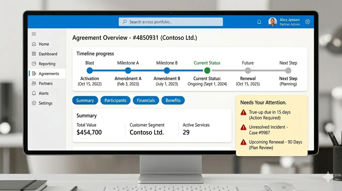
Agreement overview with alert notifications — alerts inform partners of issues but provide no guidance toward resolution. AI-generated representation.

Finding 4 — Alert Problem Audit Evidence · 11/16 participants ignored alerts
1
Alerts describe events, not actions — Messages like "Agreement updated" state what happened but give no guidance on what to do next.
2
No prioritization between critical and informational — A renewal expiring in 2 days and a routine status update are displayed with identical visual weight. Urgency was impossible to assess at a glance.
3
Partners must navigate to understand the issue — Every alert required clicking through to a separate page before determining whether action was needed, adding steps to every critical workflow.
"I don't know if this is urgent or not until I click through and spend five minutes reading it."
— Licensing Specialist, Enterprise Partner
Research Insight
Partners missed critical agreement deadlines due to unclear alerts — they could not distinguish urgent from routine notifications.
Central Research Finding
Partners weren't resistant to change. The platform was organized around data structure, not partner workflows. Every barrier traced back to this one root cause.
Navigation, financial layout, missing features, and broken alerts all reflected the same underlying design logic: the system was built around how data was structured internally, not how partners needed to use it.
Section 06

Recommendations & RICE Prioritization

After synthesizing findings, I facilitated a prioritization workshop with product managers using the RICE framework (Reach, Impact, Confidence, Effort). This gave research findings a shared language with product — ensuring insights translated directly into roadmap decisions rather than a backlog of unacted-upon suggestions.

RICE Prioritization Matrix — Platform Adoption Barriers Prioritized
Problem Reach Impact Confidence Effort Score
Navigation confusion High High High Medium 9.2
Alert clarity Medium High High Low 8.7
Scheduled report downloads High Medium High High 6.8
Financial layout High Medium Medium High 6.1
Onboarding guidance Medium Medium Medium Medium 5.4
✓ Alert redesign selected for highest ROI — high impact, low effort

Navigation confusion scored highest overall (9.2), but alert redesign (8.7) was selected for Sprint 14 due to its lowest implementation effort — delivering measurable ROI before longer navigation changes could be scoped and scheduled.

Recommendation 01 · RICE 9.2
Reorganize report navigation
Restructure navigation around partner workflows rather than data categories. Reduces the discovery problem identified in Finding 1 — where 74% of users bounced between systems to complete a single task.
Recommendation 02 · RICE 6.1
Progressive disclosure for financial data
Show contextual summaries first; let partners drill into detail on demand. Directly addresses the information overload pattern from Finding 3, where partners averaged 3.5 minutes searching a single screen.
Recommendation 03 · RICE 6.8
Scheduled report downloads
Automate recurring report exports to close the most cited legacy-tool dependency. Cited by 9 of 16 participants as the primary migration blocker — eliminating the weekly manual workaround for most partners.
Recommendation 04 · RICE 8.7 — Selected
Redesign alerts with next steps
Add priority levels, plain-language summaries, and action buttons to every alert. Selected for first implementation due to highest ROI — high impact on partner trust with the lowest engineering effort.
Redesigned Alert Action Center — VL Central

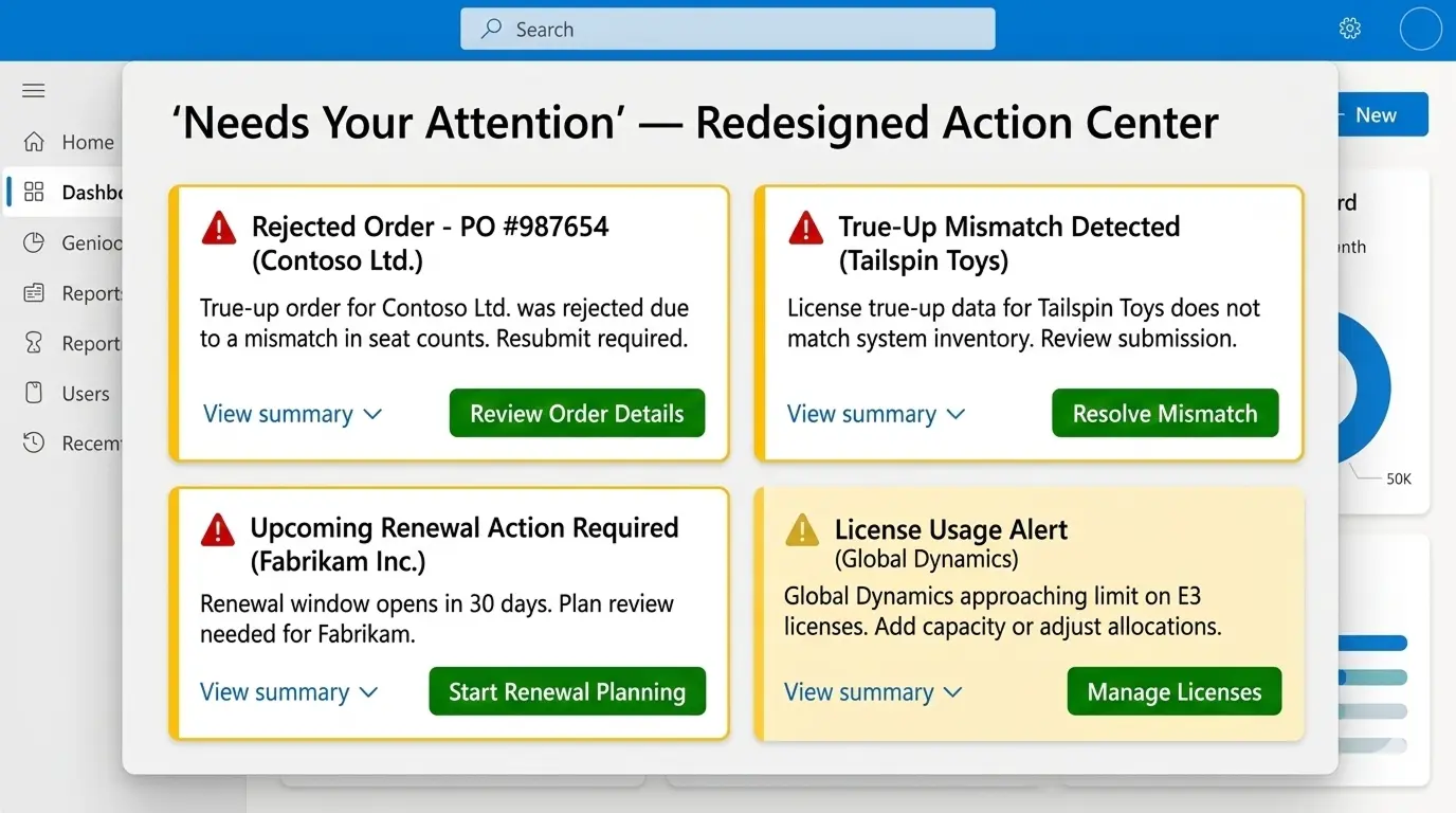
Redesigned alert action center — introducing priority levels, plain-language summaries, and direct action buttons. AI-generated representation.

Recommendation 04 — Redesigned Alerts · Sprint 14 Implemented
1
Clear priority levels — Alerts are visually differentiated by severity (Critical, Warning, Informational) so partners can immediately identify what requires urgent attention.
2
Suggested actions on every alert — Each card includes a specific action button (e.g. "Review renewal terms", "Resolve mismatch") so partners know exactly what to do next.
3
Direct navigation to related tasks — "View summary" links take partners directly to the affected agreement or report, reducing average click depth from 4 steps to 1.
Example Alert Card
Critical
Agreement expiring in 7 days
→ Review renewal terms
Research Outcome
Partners reported a 22% increase in adoption after alert redesign. Resolution time for critical alerts dropped from an average of 48 hours to same-day.
Section 07

Impact

22%
Platform adoption increase
Following alert redesign implementation in Sprint 14
4/4
Findings actioned
All recommendations entered the product roadmap within 90 days of delivery
Same-day
Alert resolution
Down from a 48-hour average before the alert redesign

Beyond adoption metrics, the research process itself had a lasting team impact. Sharing insights continuously — rather than in a single final report — established a habit of evidence-based product decision-making that extended beyond my engagement. The RICE workshop format was adopted by the product team for future prioritization sessions.

A note on attribution: As a contract researcher, I don't own implementation outcomes — those belong to the internal team who built and shipped the changes. What I can claim is the research that made those decisions possible: the evidence, the framing, and the prioritization logic that got four findings onto the roadmap within 90 days.
Section 08

Challenges

🧩
Recruiting enterprise participants
Partners were senior professionals managing large accounts — time-poor and skeptical of research invitations. I worked with the internal partner success team to co-recruit, framing sessions as feedback opportunities rather than evaluations. This produced a 78% acceptance rate.
⚖️
Legacy bias in interviews
Many partners defaulted to comparing the new platform unfavorably with tools they'd used for years. I addressed this by anchoring sessions around task completion rather than platform comparison — asking "show me how you do this today" rather than "what do you think of the new system."
📡
Incomplete telemetry instrumentation
The platform was early-stage and behavioral tracking was still being built out. Key workflows lacked event coverage. I worked with the analytics team to identify proxy signals, and used qualitative data to fill gaps — triangulating rather than depending on a single source.
Section 09

What I Would Do Differently

📓
Diary studies during migration
Our interview approach captured recalled experience rather than live frustration. A structured diary study over 2–3 weeks of active migration would have surfaced in-the-moment pain points — including the micro-decisions partners made when they hit a dead end. This would have given richer behavioral insight with lower coordination overhead than 50+ moderated sessions.
📊
Unmoderated usability testing at scale
The SUS benchmark established a baseline, but we lacked task-level completion rates. Running unmoderated sessions with 30–50 partners on specific workflows would have produced time-on-task metrics that strengthened the navigation prioritization case — the highest-scoring RICE item that was hardest to schedule for implementation.
🤝
Earlier stakeholder alignment
I started from a product brief that had already been internally approved. In hindsight, a brief alignment session before fieldwork would have surfaced competing assumptions across product, engineering, and customer success — particularly around what "adoption" actually meant to each team. That would have made findings land faster.
🌍
Regional research inclusion
Most participants were based in North America or Western Europe. Several patterns — particularly around financial reporting formats and regulatory alert language — likely manifested differently across regions. A deliberate APAC and LATAM sample would have informed whether proposed solutions needed localization.
Final Reflection
In enterprise platform migrations, the biggest challenge is rarely the interface itself. It is the disruption of established workflows. UX research in this context must go beyond usability heuristics — it needs to map how professionals actually do their work, and surface the moments where a new system breaks that rhythm.