HAI — Hello, AI.
Designing the voice interview of tomorrow.
A 20-minute live design sprint at UX Camp Amsterdam that turned into the concept I couldn't stop thinking about.
Shark Tank: a 20-minute design challenge, judged live
Teams of UX Camp attendees — strangers an hour earlier — were given a brief, a timer, and a stage. The challenge: design a human ⟷ voice AI agent interview that feels immersive and meaningful, not shallow.
Timeline
- 5–10 min — Setup, intro, team formation
- 20–25 min — Live design challenge
- 20 min — 3-min pitch + 2-min Q&A, 4 teams
- 10 min — Scoring & results
Judged on
- Problem Depth — new dimensions uncovered?
- Solution Fitness — quality, reasoning?
- Out of the Box — something original?
- Engaging Delivery — clear, and fun?
Voice AI interviews are already here. They just aren't good yet.
The brief was blunt about it: this is a win-win on paper — lower cost, more scalability, less human bias. But today's voice AI interview experiences feel shallow. That gap was the actual design problem.
Before sketching anything, I mapped the candidate's experience
My first move wasn't a wireframe — it was empathy. What does a candidate think before an AI interview starts? How do they feel mid-conversation? What do they do when they're stuck? What do they say about it afterward?
Glass box.
Not black box.
This was the principle I introduced: the interview should be a glass box, where candidates can see what's happening inside it — not a black box that leaves them confused about what's coming next. Every feature decision that followed traced back to that one line.
HAI — a name that came from someone new to this space entirely
I led the empathy mapping, introduced the "glass box, not black box" principle, and sketched the concept live during the 20-minute window — but I didn't do it alone. I worked alongside a teammate who'd never been interviewed by a voice AI before that morning. His outside view didn't just add polish — he questioned assumptions I made in real time, contributed several of his own feature ideas, and it was his idea to name the product Humantic AI — a wink at "Agentic," built around the idea that the whole concept centered humans, not just AI capability. We won with that name.
Why I renamed it to "Hello, AI" for this write-up
For this write-up, I've renamed it HAI: Hello, AI — a decision I made afterward, on reflection. "Humantic AI" is clever once you know the wordplay behind it, but it needs that explanation to land; without it, it reads as a typo of "humanistic," not a deliberate idea. "Hello, AI" doesn't need footnotes — it's instantly legible, and it does real work for the concept itself: it's literally the first thing a transparent, human-facing AI interviewer would say to you, which ties straight back to the "glass box" principle the whole idea is built on. This is a piece meant to be read cold, by someone with zero context on the room or the joke — clarity earns its keep here more than cleverness does.
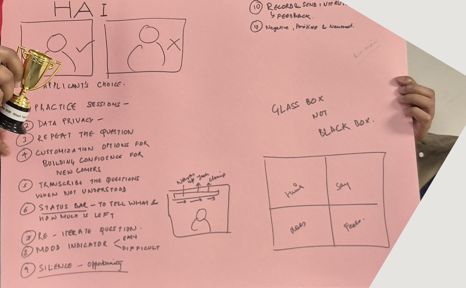
The actual board from the 20-minute sprint — sketched live, presented as-is.
Features built around trust & transparency
Candidates are told what to expect and how their data is used, before anything starts — no hidden consent checkboxes.
A visible "Pause & Think" control means 30 seconds of silence reads as thinking, not failure.
Candidates flag their own comfort level, live, so the AI reads their actual state instead of guessing from silence.
Real-time nudges — "slow down," "be concise" — instead of letting nerves build silently.
Candidates can opt into their own copy of the recording, sent instantly and paired with feedback later.
Self-view is a toggle, not a default — one of the only controls that's fully the candidate's.
Features built for confidence & access
- Same logic as a psychometric warm-up
- Nothing counts until the real thing
- Builds comfort before it matters
- Adjust pacing & intensity only
- Never who's asking the questions
- Boundary kept to avoid reintroducing bias
- Rephrase or example, on request
- Not just a replay of the same audio
- Audio alone isn't always enough
- Covers accent variation & international candidates
- Introduction / Technical / Behavioral shown as progress
- Neither party watches the clock
- Quick calibration question, before starting
- "How was that for you?" — feeds the product, not a survey
First place — scored on problem depth, fitness, originality, and delivery
Four teams, one shared brief, twenty minutes on the clock. HAI won on the strength of the "glass box" framing and the density of candidate-first details packed into a single sketch.
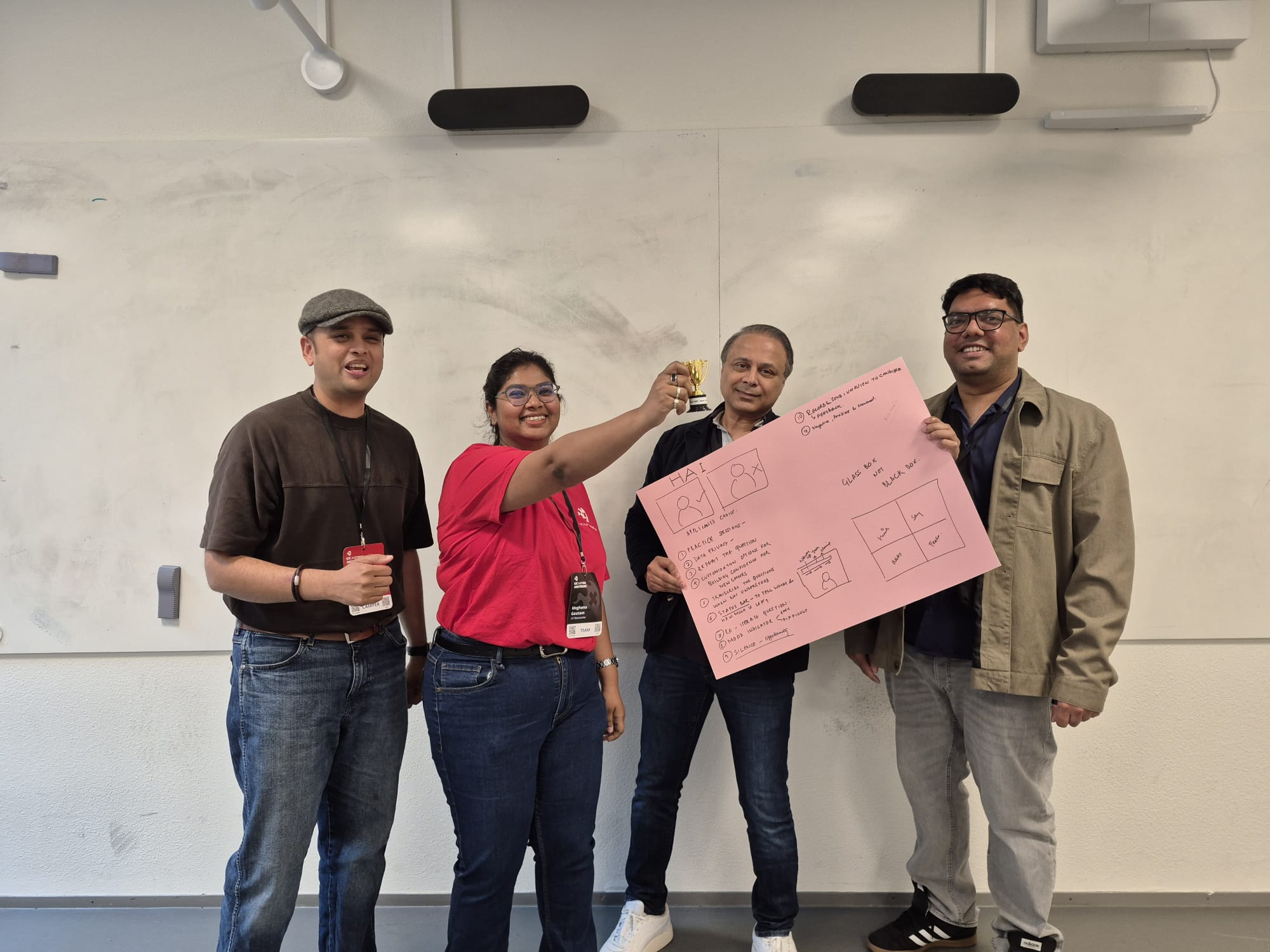
Winning wasn't the end of it. The harder questions came after.
Twenty minutes is enough to sketch a concept. It's not enough to interrogate whether the AI underneath it can be trusted to be fair. That's what I kept coming back to in the weeks after.
- Needs data spanning most English accents & dialects
- Regional, non-native, code-switched
- Risk: fumbles candidates from certain backgrounds
- How is tone actually being read?
- Varies hugely by person & culture
- Needs better, or licensed, training data
- Same question, different answer each time
- Different judgment risk per candidate
- Are two candidates even graded the same way?
- Being "in the script" ≠ well-timed
- Timing & relevance aren't guaranteed
The category already exists. The trust problem is exactly where I focused.
- Biggest name — AI video interviews in 40+ languages
- Already has practice sessions
- Candidates still call it impersonal — the "shallow" gap
- Focuses on notes & summaries, post-interview
- Doesn't touch what happens during
- HAI's live mood/transparency ideas fill that gap
- Measurable gender bias in AI voice interviewers
- Argues for visible sentiment, not a hidden score
- 19% of orgs admit missing qualified candidates
- Echoes the accent & tone concerns raised earlier
Official EU AI Act guidance · 2026 Enforcement Guide
A 20-minute sprint is a stress test for judgment, not knowledge
- Brief's data treated as ground truth — no re-research
- Empathy map as compass, not a literature review
- One held-to principle: glass box, not black box
- Practice sessions, visible sentiment, data retention — still the hard problems
- Same features the post-event questions kept circling back to
- Instincts held up. Defensibility needs the deeper work.
The sprint got the instincts right. The deeper research is what would make them defensible.
That's HAI.
Sketched in 20 minutes. Still on my mind a week later. Thanks to UX Camp Amsterdam and the judges who scored it 1st place.