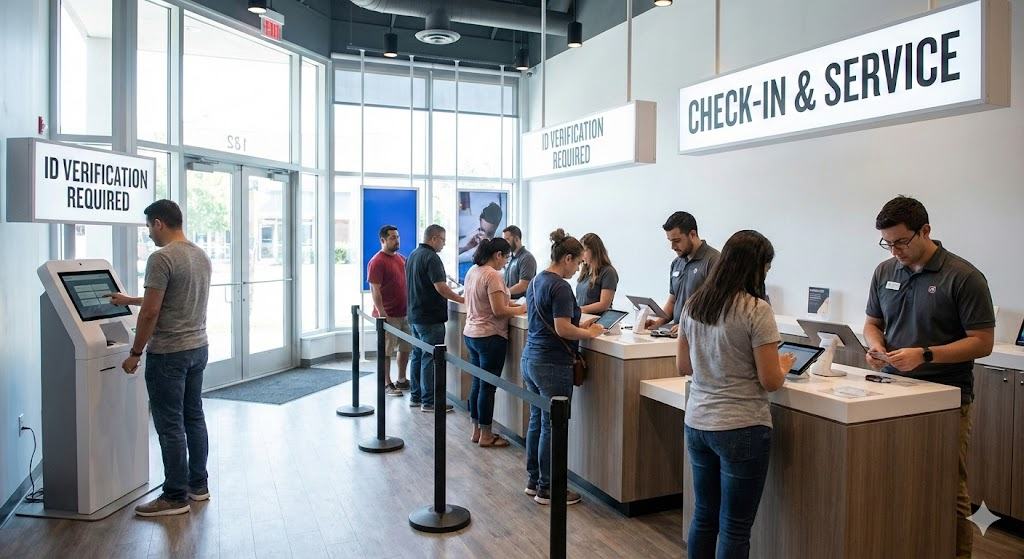
Retail store representatives were bypassing the arrival kiosk. Customers were avoiding it. That was the real research brief.
A major U.S. telecom retailer mandated a kiosk-first ID verification system across its stores. Store Customer support agents were quietly routing customers around it. Customers were hesitating, refusing, or walking straight up to a person instead. Understanding why both groups were doing this changed everything about how we framed the problem.
My Role
UX Research Consultant
Timeline
Nov 2024 – Jan 2025
Research Scope
20 Pilot Stores
Methods
Interviews · Observation · Shadowing
Industry
Telecom Retail
Read as
A mandatory ID kiosk was placed at the entrance of hundreds of U.S. telecom retail stores.
The goal: speed up service by having customers self-identify before speaking to a customer support agent.
What was actually happening: Customer support agents were quietly skipping the kiosk during busy hours — and customers were confused, hesitant, or refusing to use it entirely.
The problem wasn't the interface. It was trust.
Before & After — at a glance
Before
No context. No reason. Just a demand to comply before anyone had explained why.
→
After
Check-in reframed as help, not enforcement. Customers given a choice from the first screen.
What the research revealed
🔄
Customer support agents bypassed the system
During peak hours, Customer support agents skipped the kiosk to keep queues moving. This was the first signal that the system didn't fit real-world behaviour.
🔒
Customers didn't feel safe
Entering personal data on a shared public device — with no explanation of why — created hesitation, avoidance, and drop-off.
Identification is not a task. It is a trust transaction.
What changed across 20 pilot stores
−50%
Queue wait time
Average peak wait dropped from 2 minutes to 1 minute
20
Pilot stores
Observation studies conducted across 20 stores; initial 2-store pilot was already underway when I joined
~100%
Self-completion rate
From 3–4 reluctant customers/day to almost every customer completing independently
💡
What I'd do differently: I would have included lower-literacy users and non-English speakers from week one. Accessibility gaps emerged late in the process — a gap I now build into research planning from the start.
01 — The Signal
Both store Customer support agents and customers were bypassing the kiosk. That was the real research brief.
The company had introduced a kiosk requiring customers to verify their identity before speaking to a customer support agent. The internal hypothesis: self-identification would reduce Customer support agent workload and speed up service.
On paper, it made sense. In practice, something different was happening.
What we actually observed
During peak hours, Customer support agents were skipping the kiosk step entirely — not out of negligence, but because the system was creating more friction than it was solving.
This behaviour wasn't a compliance failure. It was a signal. The kiosk was designed around operational efficiency, but it hadn't accounted for how people — both customers and Customer support agents — actually behave under pressure.
My job wasn't to fix the interface. It was to understand the system underneath it.
02 — Before: What Existed
A mandatory system that assumed compliance would follow policy.
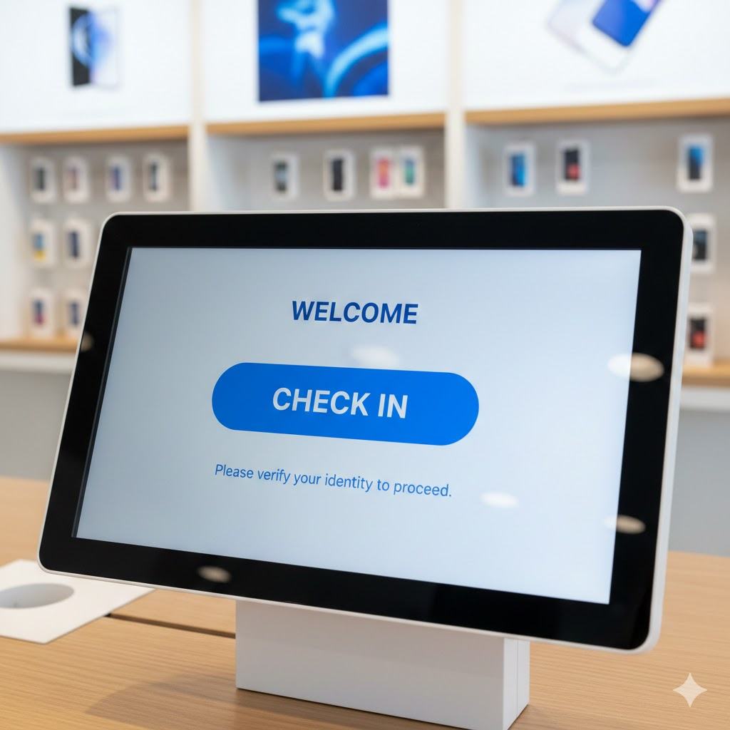
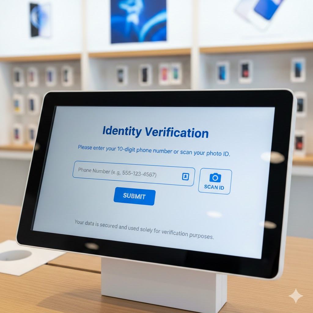
The original kiosk flow had two screens: a bare welcome screen directing customers to check in, followed immediately by an identity verification screen requiring a phone number or photo ID — with no explanation of why.
The customer journey through the original kiosk — two screens, no context, no choice:
Step 1 — Entry No context, no explanation. Just "Check In."
→
Step 2 — Data capture Personal ID requested before any trust established.
The problems compounding this experience:
⏱️
Queue times weren't improving
Despite the kiosk being designed to speed things up, wait times remained inconsistent — especially during peak hours.
🔒
Privacy concerns were rising
Post-regulatory changes meant customers were increasingly wary of entering personal data on shared, public-facing devices.
🔄
Inconsistent enforcement
Different stores followed the policy differently. Some Customer support agents enforced it; others bypassed it entirely during rush periods.
🤝
Customers preferred people
Many customers simply walked up to Customer support agents directly. The kiosk felt impersonal and unnecessary when the store wasn't busy.
03 — The Reframe
The problem wasn't usability. It was a question of trust and context.
When I came on board, the ask was to "improve the kiosk experience." I pushed back on that framing early.
Original brief
"How do we improve kiosk usability?"
→
Reframed question
"How might we design an identification system that balances operational efficiency, privacy trust, and real-world retail behaviour?"
This shift moved the project from interface optimisation → workflow redesign. It also changed who we needed to talk to: not just customers, but store Customer support agents, compliance leads, retail operations managers, and store directors.
04 — Research Approach
I didn't run a usability study. I investigated the system.
📋 Context when I joined: An initial 2-store pilot observation study had already been conducted, along with semi-formal interviews with store Customer support agents, store managers, and a small number of customers. I came in to expand this foundation — broadening the research scope, structuring the synthesis, and translating findings into actionable recommendations across 20 stores.
The problem involved policy, staffing, incentives, customer psychology, and technology trust — all at once. A single-method study would have only revealed part of the picture.
15
Moderated Interviews
Urban retail visitors, mixed demographics, age groups, tech comfort levels
2
Observation Modes
Peak & non-peak in-store behavioural observation to capture real-time patterns
5+
Customer Support Agent Shadows
Understanding workarounds, override behaviour, and on-the-ground decision making
8
Stakeholder Interviews
Retail ops, compliance, store managers — mapping conflicting priorities
The Customer support agent shadows were the most revealing. Watching how staff actually used — or didn't use — the kiosk in real conditions told us more than any customer interview could about where the system was structurally broken.
05 — Organisational Diagnosis
Three teams. Three definitions of success. Zero alignment.
One of the most important findings wasn't from customer research — it came from stakeholder interviews. Each team was optimising for a completely different metric.
Retail Operations
Get customers through the door and served quickly. Reduce queue time at all costs.
Measures: Throughput & Queue Speed
Compliance Team
Every customer must be verified before service. Consistency across all locations is non-negotiable.
Measures: Verification Accuracy
Product Team
More customers completing the kiosk flow means the product is working.
Measures: Kiosk Adoption Rate
⚠️ The result: High kiosk adoption was celebrated internally — even when customers felt confused, forced, or invaded. The teams weren't measuring the right thing.
My recommendation: shift the success metric from "kiosk adoption rate" to "identification friction score" and "trust clarity rating." Adoption means nothing if people feel coerced into using the system.
06 — Key Findings
Three barriers. One underlying truth about trust.
❓
Customers didn't understand why
The kiosk asked for personal information with no explanation. When people don't understand the reason, they feel suspicious — not compliant.
"If the store is empty, why can't I just talk to someone?"
👁️
Shared screens felt unsafe
Entering a phone number or scanning ID on a public, shared kiosk created visible discomfort — especially post-regulatory changes heightening privacy awareness.
🙋
People trusted people more
Many participants trusted a customer support agent with their ID more than a machine. The kiosk removed the human element at exactly the moment people wanted reassurance.
"If I have to show ID, I'd rather show it to a person."
📱
The system worked — situationally
Regular customers during long queues appreciated faster processing. Some preferred digital over repeated verbal explanation. The kiosk wasn't bad — it was one-size-fits-all.
The Core Insight
Identification is not a task. It is a trust transaction.
When the context signals urgency or complexity, customers prefer human reassurance. When context signals efficiency and predictability, digital works. The system failed because it assumed one context for every customer, every time.
07 — Design Response
From mandatory compliance to an adaptive, trust-first experience.
The redesign wasn't about making the kiosk prettier. It addressed four structural problems: no context, no privacy assurance, no choice, and no human fallback.
🤖
Images created using Gemini AI All kiosk screens shown are AI-generated concept illustrations, created to communicate the design intent while respecting the telecom provider's proprietary branding and IP. The Gemini watermark (✦) is intentionally retained to make clear these are generated visuals — not actual product screens.
The complete redesigned customer journey — five steps from entry to confirmation. Click any screen to enlarge.
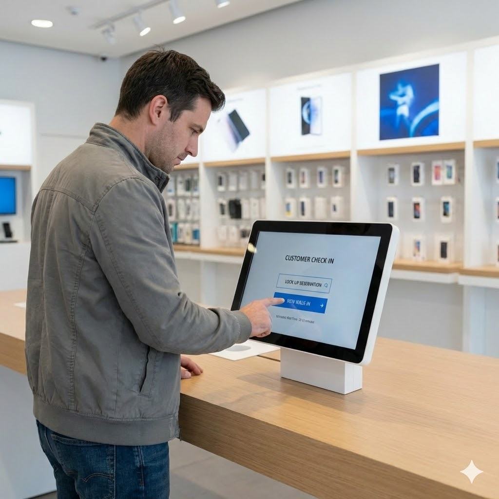
Step 1 — Entry
Entry
A choice, not a command
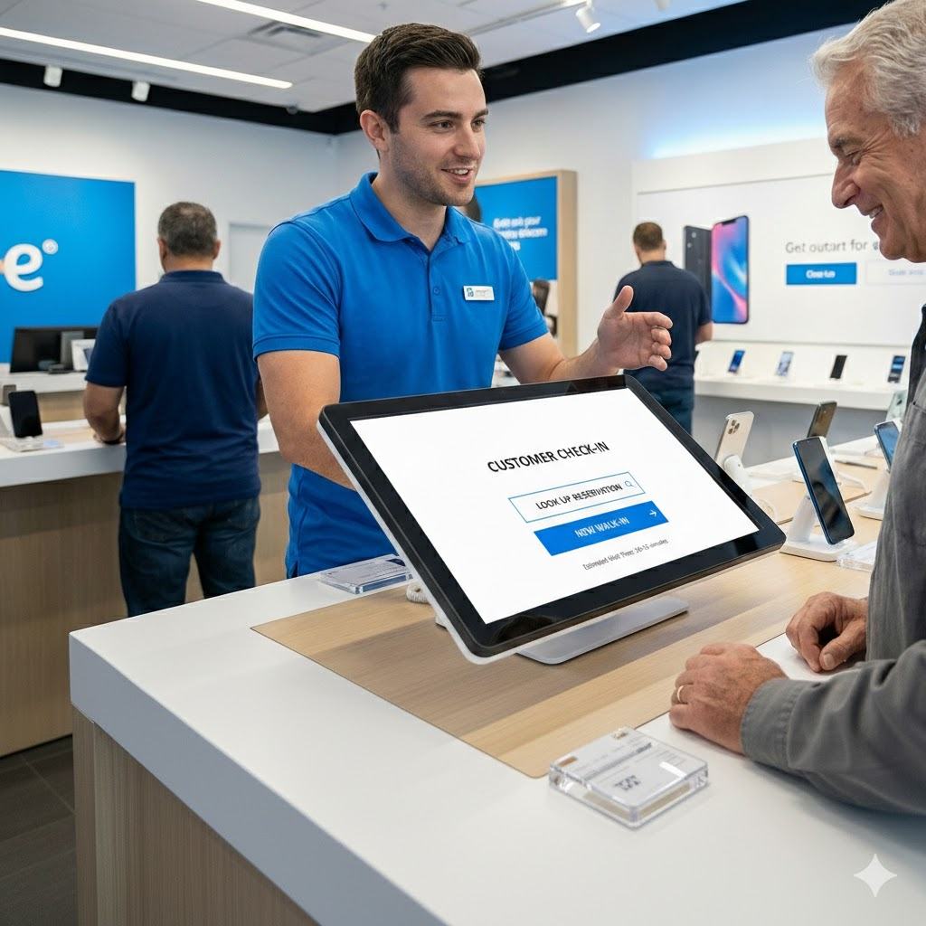
The first screen no longer demands compliance. It reframes check-in as help. Customers can self-serve digitally or speak to a customer support agent — their call, from the very first moment.
customer proceeds to
↓
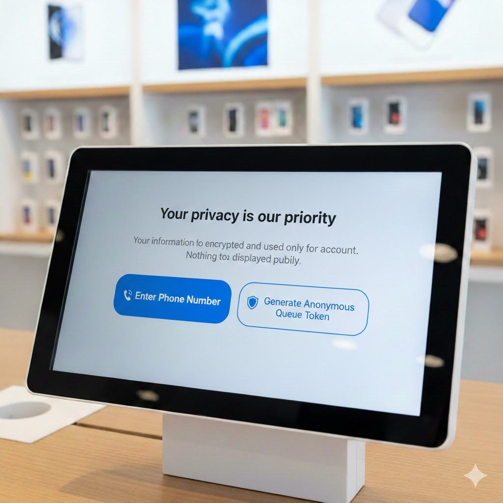
Step 2 — Privacy
Privacy First
Assurance before data
Before asking for anything personal, the screen leads with "Your privacy is our priority." Customers can enter their phone number or generate an anonymous queue token — no personal data required.
if they want to know why
↓
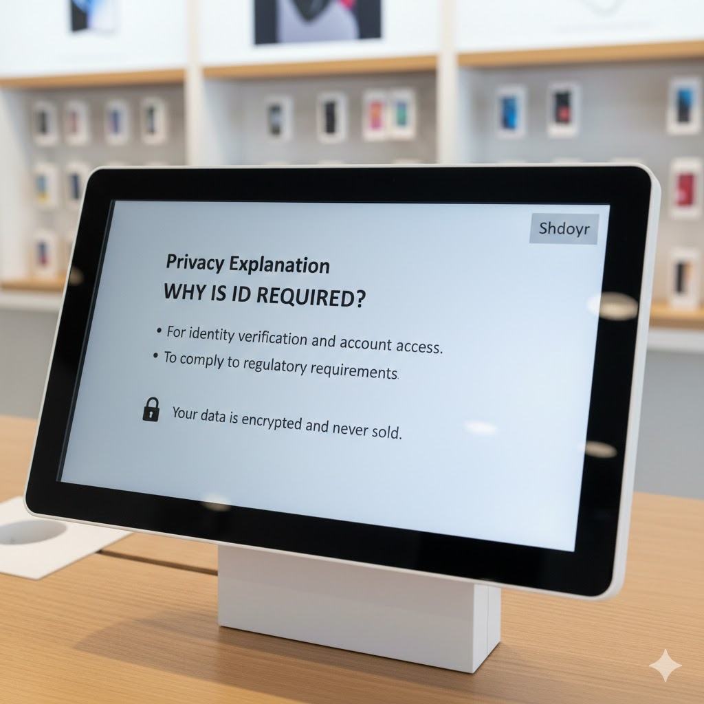
Step 3 — Transparency
Transparency
Why is this even needed?
One of the biggest friction points was that customers simply didn't know why they were being asked. This screen answers it plainly: for identity verification and account access. Your data is encrypted and never sold.
identity confirmed
↓
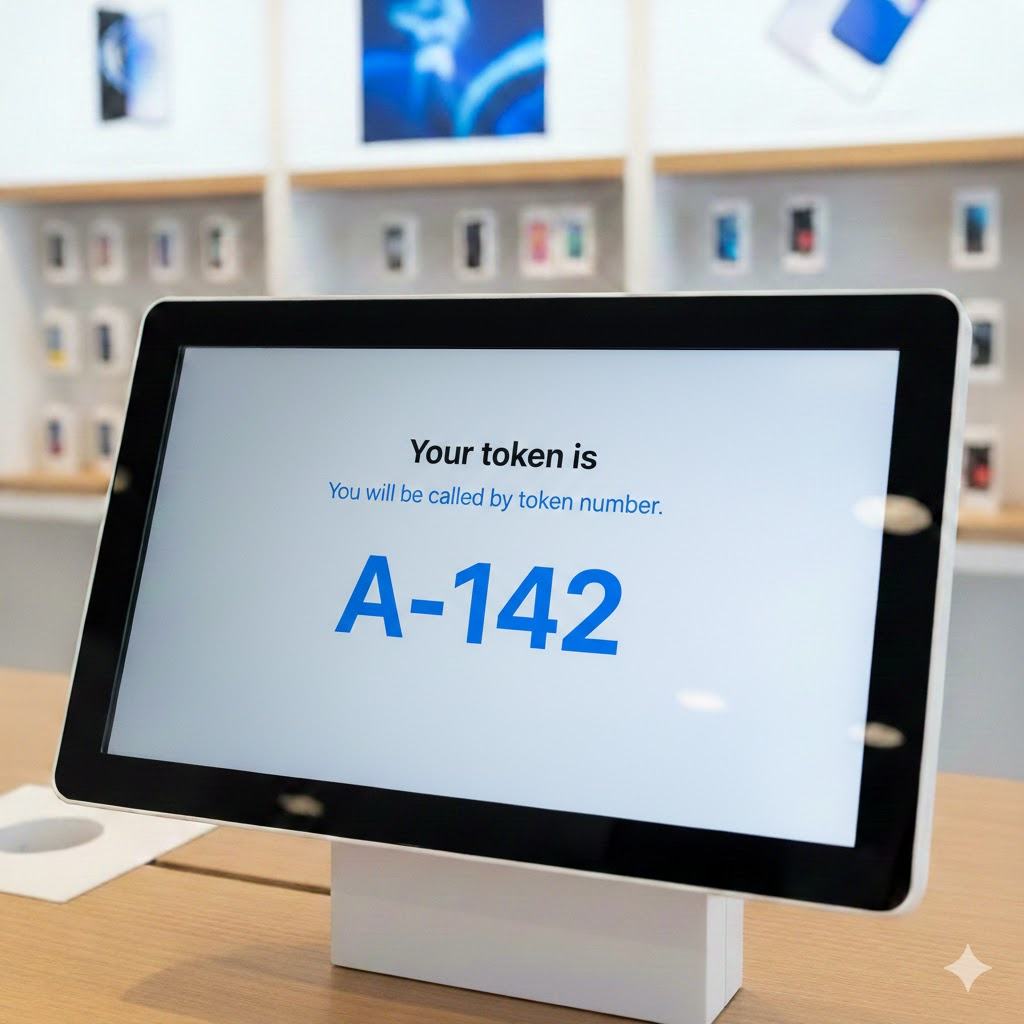
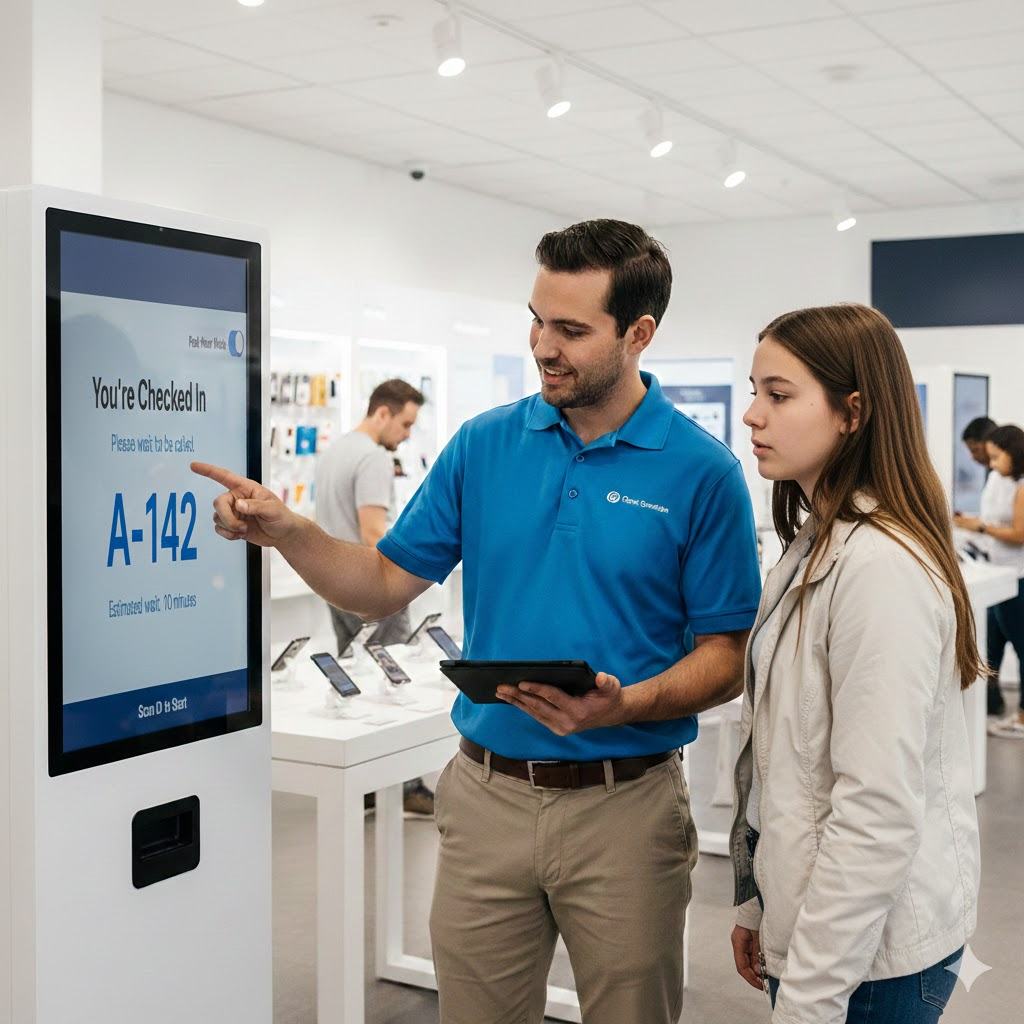
Step 4 — Token
Token Issued
No more public name-calling
Customers receive a token number instead of being called by name across a busy store. A small change with a big privacy impact — especially for customers who had raised concerns about being identified publicly.
customer joins the queue
↓
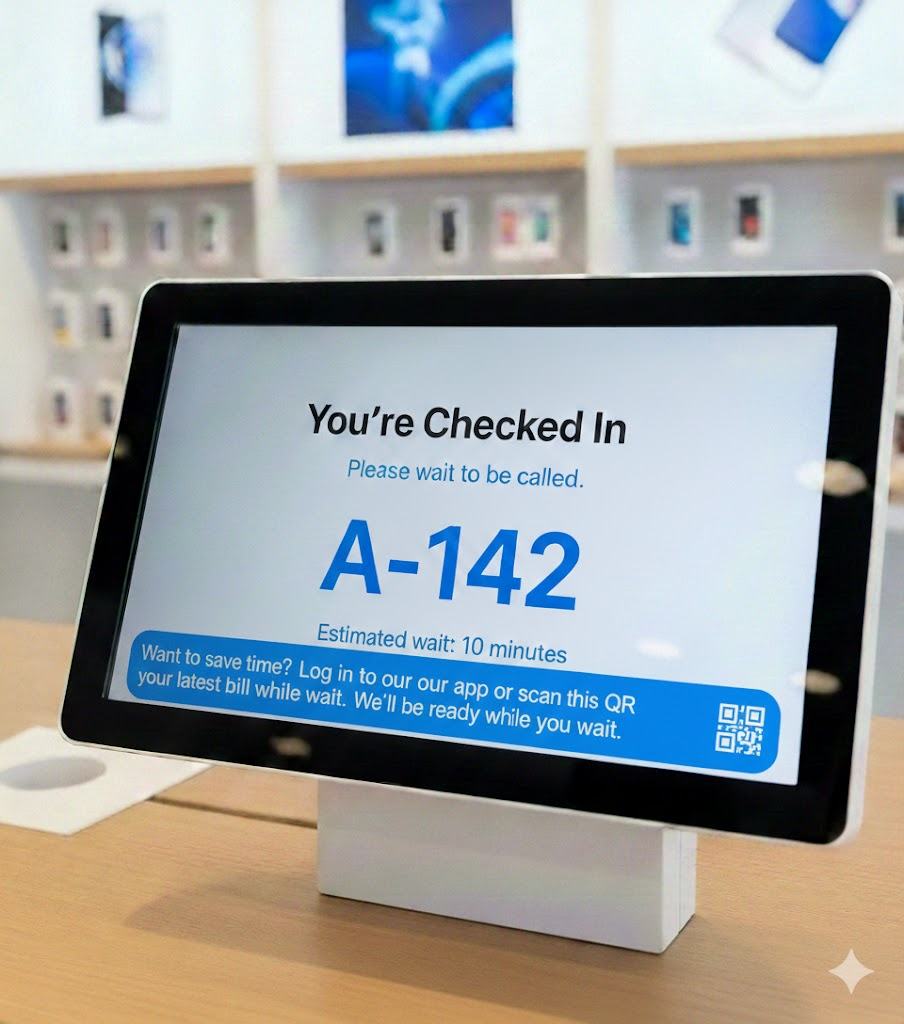
Step 5 — Confirmation
Done
You're checked in. Here's your wait.
Clear completion state with estimated wait time. A light engagement prompt ("Preview your bill while you wait") productively fills the queue time — reducing perceived wait without demanding attention.
With purpose-setting and privacy assurance upfront, customers completed the flow independently — without confusion or hesitation.
08 — Customer support agent & Operations Layer
The kiosk alone couldn't solve it. The people around it had to change too.
Two critical additions addressed what no kiosk redesign could fix on its own: human-assisted onboarding for customers who need it, and real-time operational visibility for store managers.
Customer support agents trained to bridge the digital gap — particularly for older or first-time visitors. The human layer was formalised, not left to chance.
Customer support agents shown how to guide customers through the new flow, building confidence rather than creating confusion.
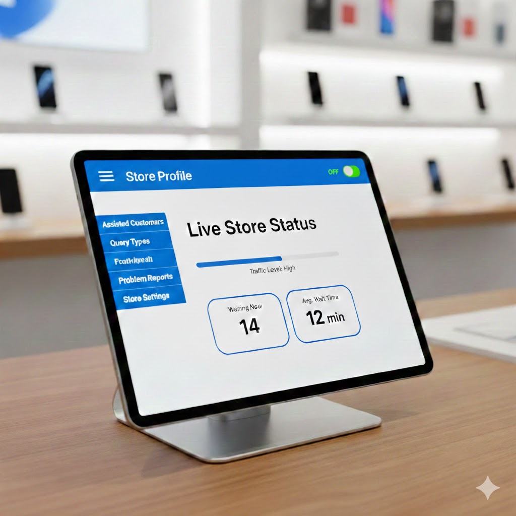
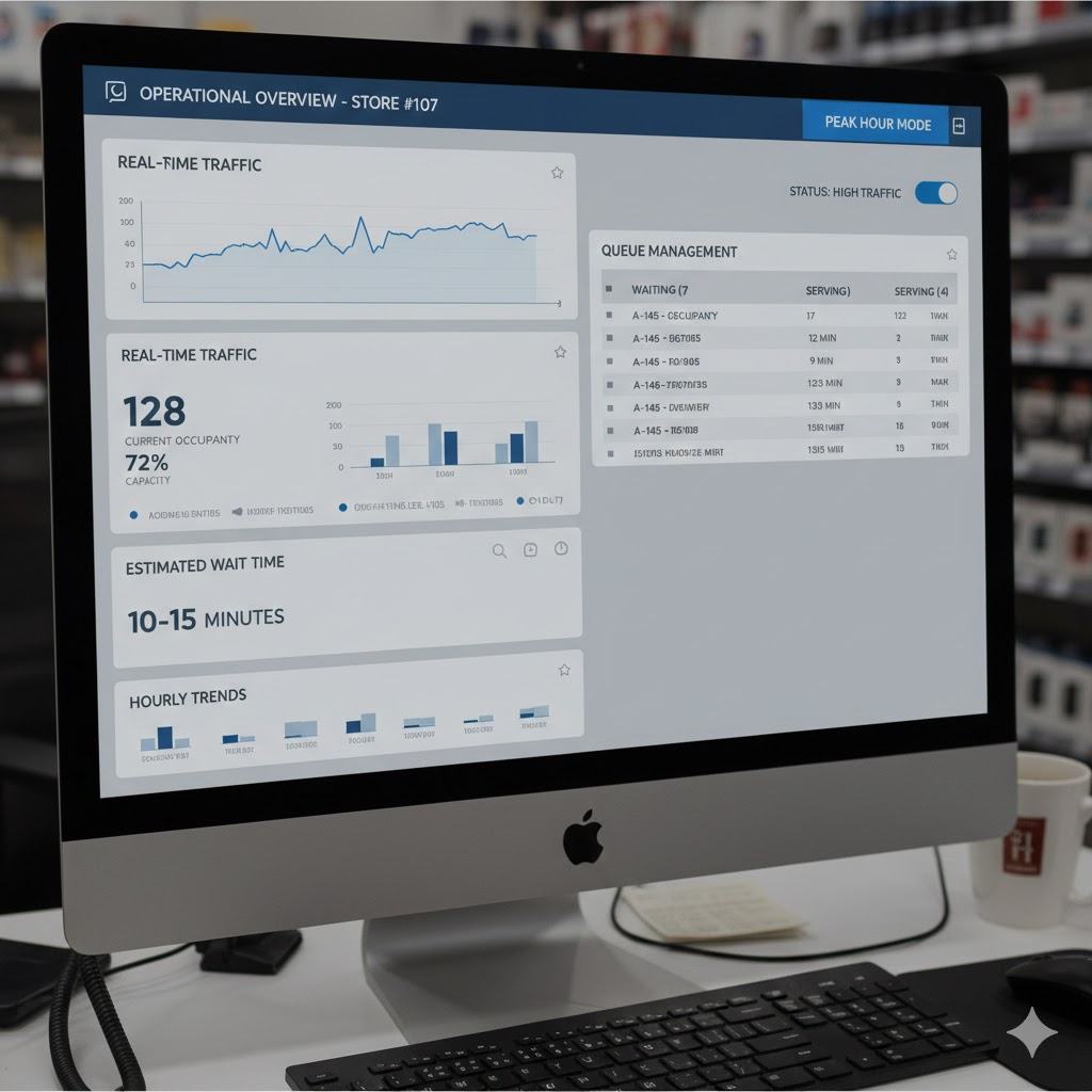
Real-time queue data on Customer support agent tablets. Previously, Customer support agents overrode the kiosk during peak hours because they had no visibility of actual queue pressure — now they do.
Store manager dashboard: Peak Hour Mode toggle, real-time occupancy, estimated wait, hourly trend data. Empowers adaptive enforcement rather than rigid policy.
09 — Workflow Comparison
One rigid path in. A flexible, context-aware system out.
Before — Mandatory Kiosk-First
1
Customer arrives
2
Mandatory kiosk check-in — no exceptions
3
Scan ID or enter phone number
4
Privacy acceptance (forced)
5
Verification — if failed, Customer support agent intervenes
!
Customer support agents bypassed steps 2–4 during peak hours — creating an uncontrolled shadow process
After — Adaptive Dual-Path
1
Customer arrives
2
Peak Hour Toggle — auto-detects high traffic, activates fast-track
3
Customer chooses: Quick Digital Check-In OR Speak to a customer support agent
4
Privacy explanation shown upfront — opt-in, not forced
5
Token issued — no public name-calling
✓
Customer support agent override becomes a designed path, not a workaround
10 — Impact
Across 20 pilot stores, the numbers told a clear story.
20
Stores in Research Phase
Observation studies expanded across 20 stores, building on the initial 2-store pilot that was underway when I joined
−50%
Queue Time Reduction
Average in-store wait dropped from 2 minutes to 1 minute during peak hours in pilot stores
↑ Near 100%
Self-Completion Rate
Previously, only 3–4 customers per day completed check-in willingly. After redesign, almost all customers completed it independently, without guidance or confusion
The shift in self-completion rate was the most meaningful signal. It wasn't about getting people to click a button — it was about designing a system people chose to engage with, because it made sense to them.
11 — Reflection
What this project taught me about research in complex systems.
🔍
The bypass was the brief
Customer support agent workarounds aren't compliance failures — they're the system's honest feedback. When people consistently find ways around a policy, the policy needs rethinking, not the people.
🏛️
Org dynamics are part of the UX problem
Three teams measuring three different things meant no one was measuring what actually mattered to the customer. Shifting the KPI conversation was as important as the design work.
🤝
Trust before task
You can't ask someone to hand over their identity before you've explained why, who sees it, and what happens to it. Every interaction that requires personal data is a trust negotiation first.
🌀
What I'd do differently
I would have included lower-literacy users and non-English speakers earlier in the research. We discovered accessibility gaps late in the process — something I'd build in from week one on a future project.